
A while back I got an assignment from my Advertising Creativity class, which is to design an art for ad campaign in your own country that is taken from an ad campaign from other country.
I came across this “safety pin” Durex condom ad and although it has an interesting concept, I know it wont have such a great impact if the same concept is to be implied in my country, Indonesia.
The main reason is because, the direct translation of safety pin in Indonesian has no connotation with the word safety at all (we call it : “Peniti”) So the whole art concept wont have the pun-intended joke as the artist meant to convey with the ad.
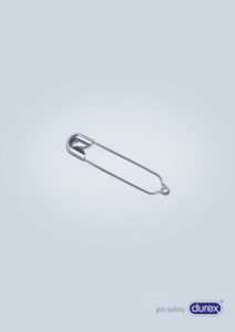
Original Ad (Photo courtesy of Google images)
The purpose of this project is to adapt the current print ad campaign of Durex condom product into something that is more understandable for the target market in Indonesia. The goal for this adaptation is to make a new print ad that still has the same character of Durex brand, but at the same time to make it more attractive, relatable, and able to send a strong message toward the target clientele in Indonesia.
In order to reach that goal, the new ad print has to be something that has a strong familiarity for the target audience in Indonesia. Hence, a different symbol going to be chosen for the new ad print, because the original one will be hard to understand by Indonesian target clientele. But, the concept of Durex Condom “Safe Sex” will still be implemented in the new ad print.
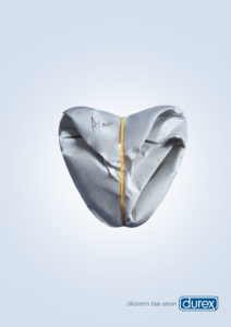
New Adapted Advertising Concept for Indonesia, by Me
There are few things to be modified and designed from the original ad, in order for the new ad print to work well in Indonesia.
- The safety pin symbol, the original symbol that Durex use won’t work in Indonesia, because the translation of safety pin in Indonesia does not have any connotation towards the word safety.
- In Indonesia, most people who buy food in Indonesian type of restaurant will receive their food in a banana leaf and paper wrapper together with a rubber band to tighten it and to avoid spill/mess. So for the new symbol of the ad print in Indonesia, the paper wrapper tighten with rubber band going to be used. Because it’s something that is everyone in Indonesia has used it, and familiar with it.
- The design itself is going to be emphasize on the rubber band that being used to tighten the paper wrapper, this is done by using the contrast color of dark yellow in the final artwork. The reason to put the rubber band as the punchline is because, rubber band in Indonesian direct translation is also can be used as the same connotation with condom (we call it : “Karet”).
- The shape of the paper wrapper will be morph into the shape of heart instead of just like a normal food wrapper shape, and without making it too obvious but, if the art is being looked upside down it will also look like the tip of a male organ. This is to symbolize the concept of making love and strengthen the use of condom which is to be used to have a safe and protected sexual intercourse.
- To support the whole symbol, the tagline that being used in original ad print: “pin safely”, has to be changed as well. The new tagline will be “dikaretin biar aman”, which means “rubber it to be safe”. This tagline is chosen because of the fact that it works on multiple meaning, it works together with the food wrapper with rubber brand, and at the same time it work with the connotation of using condom to have a safe protected sexual intercourse.
- The final touch of the new ad print will be the word Ayam which means chicken, attached to the wrapper. It is common practice for the seller to write the type of food people ordered on the wrapper. At the same time, it will serve as comedic purpose and deeper meaning in the new ad print, because Ayam means chicken or could be interpret as cock which is a famous urban slang for male organ.
By using the new key design and symbolize for the new ad print, this Durex ad campaign will be more approachable by the target clientele in Indonesia, because familiarity of the art in the ad leads to a strong brand recall of the product. And of course something that has comedic purpose and double meaning are easier to be remembered by the target audience.
Disclaimer : I found the original ad from google, credit will be given towards the respective artist once known
fin xx
Hi, unfortunately, I faced challenges with the slow loading speed of your website, leading to frustration. I recommend a service, linked below, that I’ve used personally to significantly improve my website speed. I really love your website…Optimize now